Feud: Bette and Joan

To me, Production Design is the quirky cousin of Interior Design who prefers to shop at Goodwill and exclusively listens to records. Production Designers are a strange hybrid of decorator and historian, especially when designing a period set. When doing a period television show or movie, set design is of the utmost importance and can make a break the vision that the show's writers had for the production. One of the most impressive recent examples of the craft are the sets for Feud: Bette and Joan. Judy Becker's talents as a Production Designer are on full display in Ryan Murphy's newest venture and I couldn't be more happy about it.
Judy Becker has done the Production Design for multiple Oscar winning flms including American Hustle, Silver Linings Playbook, and Carol. Her ability to design a set that is authentic, yet not kitchy, is impressive. Feud's set design pulls inspiration from historic images of the places and spaces in which Bette Davis and Joan Crawford lived their lives. The accuracy is uncanny and brings to life 1960s Hollywood in all of its grandeur and viscousness.
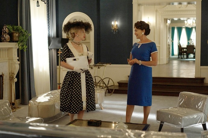
Three locations dominate the television show's set design: Joan Crawford's home, Bette Davis' home, and Perino's Restaurant. The design for Crawford's home is inspired by Crawford's actual home located in the Brentwood neighborhood of Los Angeles' westside. The home used for filming is located in Holmby Hills on S. Beverly Glen Boulevard and architecturally resembles the home used in Mommie Dearest, the biographical film about Crawford and her daughter. Becker's treatment of the set's interiors features jewel tone colors, Regency furniture, and gold accents. Details like the fake portrait of Joan above the fireplace and the plastic furniture covers give the set authenticity and reflects Crawford's youth obsessed and damaged personality.
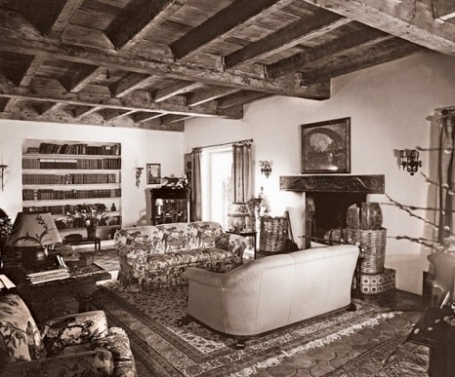
Bette Davis' home was researched to the same extent as Crawford's. Using archival photographs, Becker creates a cozy, dimly lit, grandma chic interior that represents Bette's character and preference for the understated. The old school and warm feel of Bette's home is juxtaposed with Joan's over-the-top spaces to show, yet again, how different the two women were. The use of the sets as a tool to tell the story is one of my favorite things about this television show and shows just how talented Becker really is.
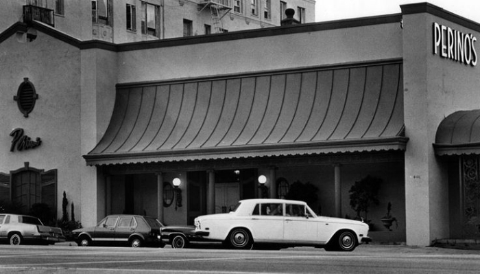
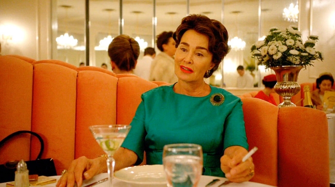
The most prominent public space featured in the show is Perino's. The restaurant was a Hollywood staple from the 1920s to the 1970s located in, what is now, Koreatown. Old Hollywood elites, like Joan Crawford, dined at the restaurant religiously throughout all of its decorative iterations. After a fire, the restaurant was redesigned by Paul R. Williams in the Hollywood Regency style. This era of the restaurant is what Becker used for Feud's set design. The pink velvet channel tufted booths and gilded French furniture are carbon copies of the actual restaurant and lend credibility to the show's aesthetics and story.
Feud's sets act as supporting roles for the main characters and storyline. Without Becker's attention to detail there would be something amiss about the story and its level of authenticity. Just as a room can change someone's mood, a set can change the quality of a production.
Check out the season finale of Feud: Bette and Joan this Sunday on FX at 10PM.
Cheers,
Hugh


